Ene mene muh
Graphic Design, 2021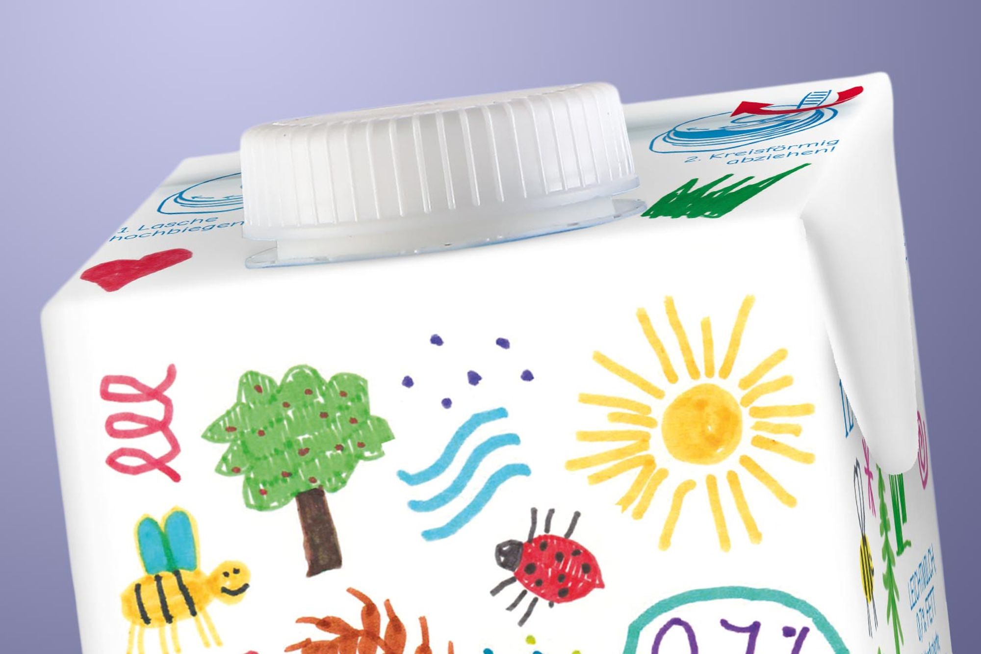
A Redesign?
When "Die leichte Muh" put out an open call to design the packaging for a one-year special edition of their breakfast milk "Die leichte Muh", Max Kure and I were just sitting in the garden and spontaneously decided to create a small packaging design. We didn't want it to look like the packaging you'd see in the refrigerated section, but to be something you have never seen in this context. Knowing that we might lose our chance to win first place, we decided to go this route because we saw it more as a personal experiment. But still: our design, which we named "Ene mene muh", reached the 16th place out of 230 in the ranking.
Illustrations
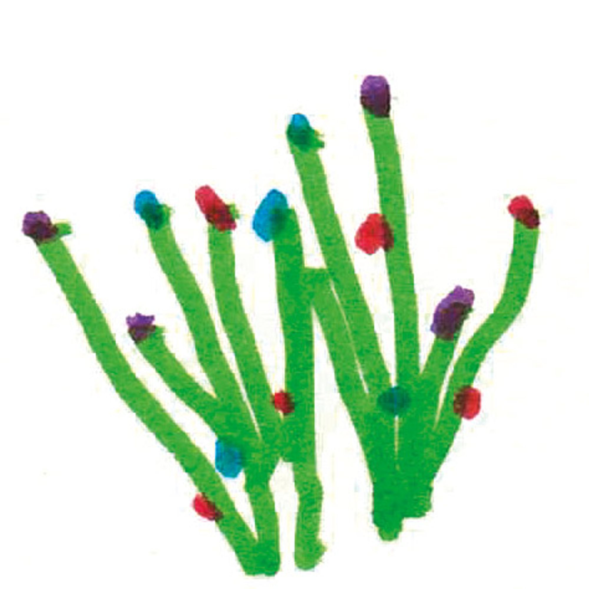
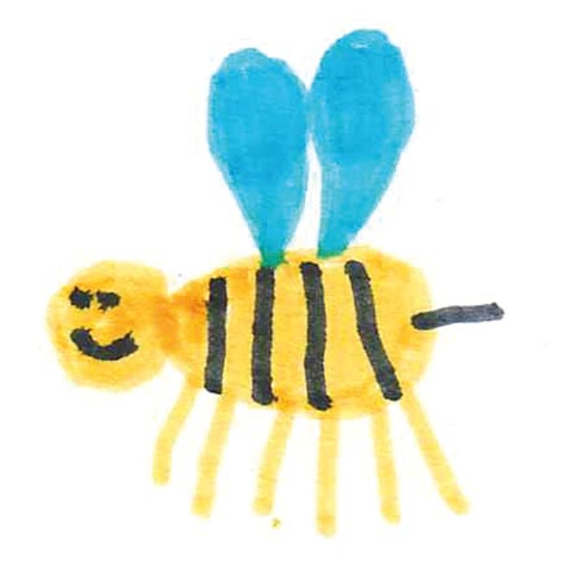
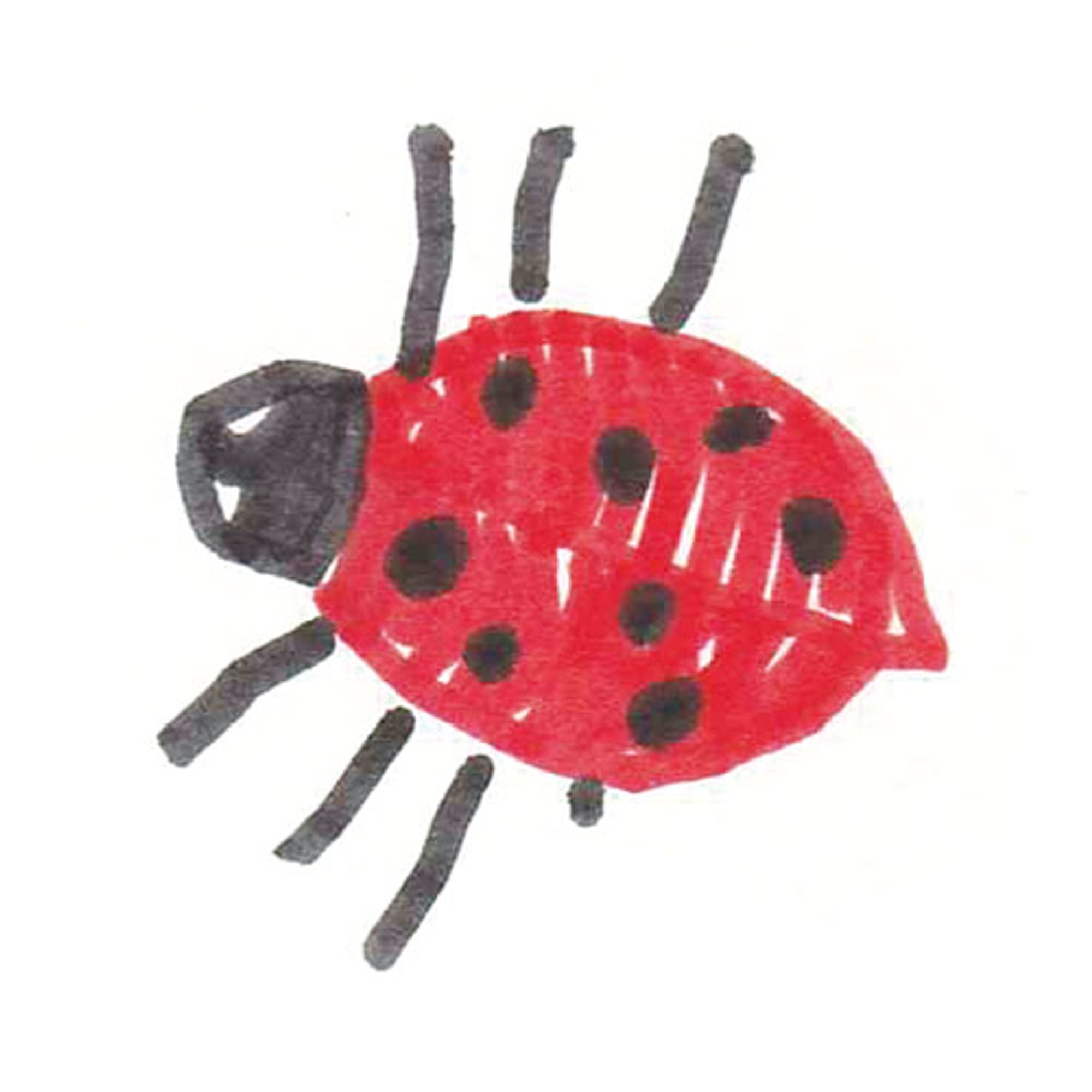
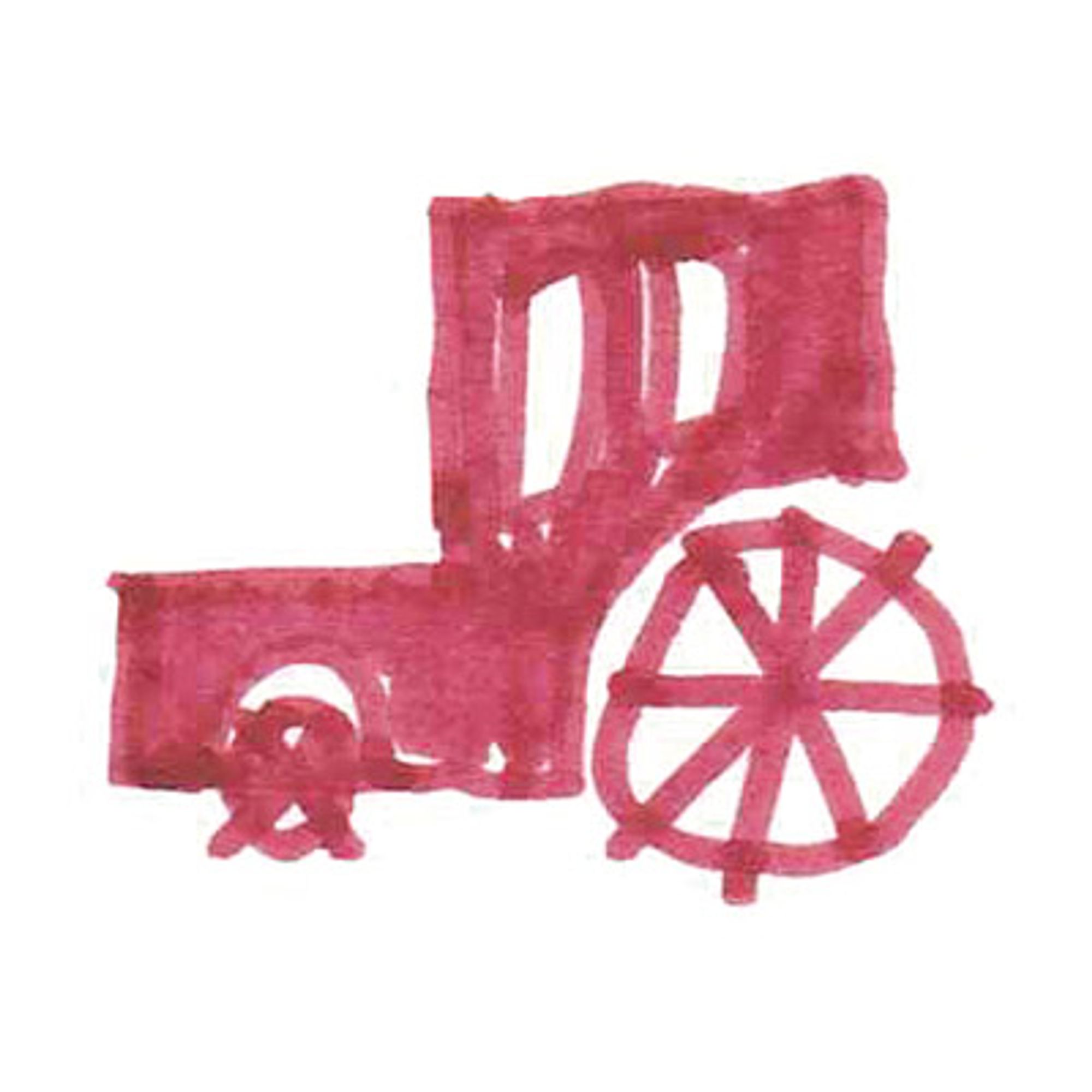
Playful illustrations were to convey a swinging lightness and at the same time communicate the brand characteristics. For this purpose, we created over 80 illustrations that were arranged in an appealing composition on the entire packaging.
Credits
"Ene mene muh" was our contribution to the open call of "die leichte Muh Designwettbewerb" and was first published on the Facebook page of "die leichte Muh". Illustration and design by Max Kure and Leo Mühlfeld